
DuckConvert · · Updated
How to Convert PNG to ICO (Without Uploading Your Logos)
If you are a web developer or designer, you know that every website needs a favicon (the little icon that appears in the browser tab). While modern browsers support PNG and SVG favicons, the traditional .ico format is still required for legacy support, enterprise environments, and Windows desktop application icons.
You probably have a beautiful, transparent .png logo ready to go, but you need it in .ico format.
The Problem with Free Icon Generators
Searching for an "ICO generator" yields dozens of free websites. However, nearly all of them operate on the same flawed premise: they force you to upload your proprietary logo to their server.
Why is this an issue?
- Intellectual Property Risks: You are sending your unreleased logo or client's branding to a third-party server. You have no control over how long they keep it or who sees it.
- Slow Workflows: Waiting for a file to upload, process in a server queue, and download is frustrating when you just need a 16x16 pixel icon.
DuckConvert: The Local ICO Generator
DuckConvert solves this by bringing the image processing software directly into your web browser.
When you convert a PNG to an ICO on our site, your file never leaves your computer. Our tool uses HTML5 Canvas technology to read your PNG and wrap it in the proper Windows Icon header format entirely offline.
How to use it:
- Head to the Image Converter.
- Drag and drop your
.pngfile into the upload zone. - Select ICO Icon (.ico) from the output format dropdown.
- Click Start Conversion.
The process is instantaneous. You will immediately receive a properly formatted .ico file ready to be dropped into your website's root directory or linked in your HTML <head>.
Keep your branding private and speed up your workflow with local conversions!
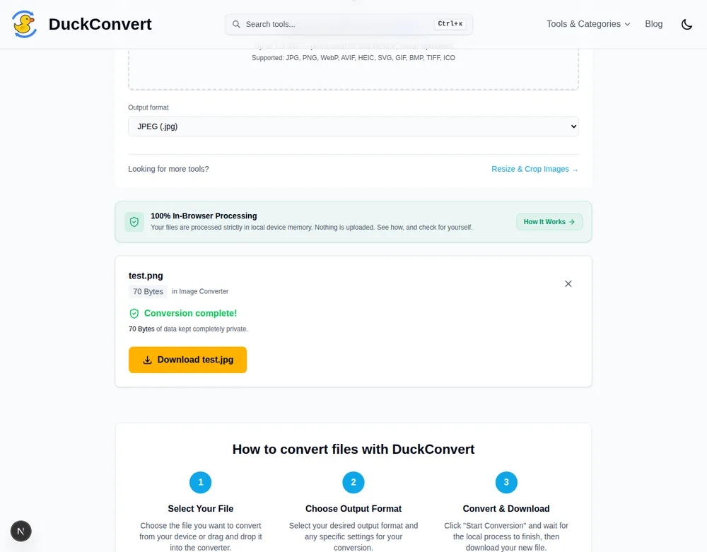
The Image Converter this guide describes, converting a real test file.
An ICO is a container, not an image
The thing that surprises people about ICO is that a single .ico file holds
several images at once. The format begins with a directory listing every image
it contains, each with its own width, height, colour depth and byte offset. The
operating system or browser then picks whichever entry best fits the context it
is rendering into.
That design is a product of where icons get used. Windows shows one size in a file listing, another in the taskbar, another on the desktop, and another again in a properties dialog. Letting the icon file carry each size separately means a designer can hand-tune the small ones rather than accepting whatever a downscaler produces.
The sizes that actually matter are 16, 32 and 48 pixels square, plus 256 for modern high-density displays. 16 is the browser tab and the file list, 32 is the taskbar and most desktop contexts, 48 shows in larger list views, and 256 covers Windows' large icon view and anything on a high-DPI screen.
Why the small sizes need their own artwork
A logo that reads perfectly at 512 pixels frequently becomes an unrecognisable smudge at 16. There are only 256 pixels to work with, and any stroke thinner than one pixel either disappears or turns grey through antialiasing.
Automatic downscaling is what produces most of the bad favicons on the web. The usual failures are text that becomes illegible mush, fine outlines that vanish entirely, and multi-colour marks that blur into a single indistinct blob.
The fix is not technical, it is editorial. At 16 pixels you are not shrinking a logo, you are designing a new mark that evokes it: a single letterform, one shape from the full design, a simplified silhouette. Look at the favicons of sites you recognise instantly in a crowded tab bar and you will find almost none of them are their full logo.
Favicons in practice, in 2026
Browsers no longer need an ICO at all. A PNG or an SVG referenced from a <link rel="icon"> works in every current browser, and an SVG has the real advantage
of scaling to any size and being able to respond to the user's colour scheme
with a media query inside the file.
What favicon.ico still buys you is the fallback path. Browsers request
/favicon.ico from the site root automatically when no icon is declared, some
older enterprise software looks for nothing else, and RSS readers, link
previewers and various crawlers still reach for it first. Keeping one at the
root costs a few kilobytes and removes a class of missing-icon problem.
A reasonable modern setup is an SVG icon as the primary declaration, a
512-pixel PNG for apple-touch-icon and web app manifests, and an ICO at the
root containing 16, 32 and 48 for everything that has not caught up. The ICO is
the compatibility layer rather than the main event, which is a much smaller job
than it used to be.
What carries across from the PNG
Transparency survives. ICO supports a full alpha channel, so a logo with a transparent background stays transparent rather than picking up a white card behind it, which matters because icons appear on backgrounds you do not control: light and dark browser themes, coloured taskbars, whatever wallpaper somebody happens to be running.
Start from a square source. An icon slot is square, so a wide logo is either letterboxed with empty space, wasting the pixels you have very few of, or cropped somewhere you did not choose. Cropping deliberately to a square mark first gives a far better result than letting the conversion decide.